Tuesday, June 8, 2010

Selfies ;P


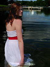
This is my first self portrait. I absolutely love water. I've been swimming like my whole life, and in May I'm always the first one in my aunt's pool even though the water is only like 40 degrees. That's why I wanted to take a photo while in water. In this photo I darkened the water and made it more blue. I also added a filter, don't remember which one, but it made the water look way sweet.


Over the weekend I went to Iowa for my cousin's graduation party. While I was there I realized that have probably spent half of my life in Iowa. This is because my mom is from Iowa and like all of my family lives there. So I thought about creating a photo that incorporates some of the things I think of when I see the word Iowa. I overlapped some pictures to create one photo. In the corner there is a photo of me and my cousin Mallory, my grandma is in the picture, and so is my mom. There is also a sign that says Feeney because that is my mother's maiden name, and the last name of most of my cousins.


Ok so this was not my original picture. I had an edited photo of me in front of the Welcome to Wisconsin sign that you see when coming back from Iowa, but it was deleted so I created this picture in like 2 minutes before it was due. Maybe I'll put my other picture up if I make it again.

So I picked this photo because it is a picture of me and my best friend Katie. She is a big part of my life, and I would not be the same person I am today if she wasn't my buddy.
:D

Wednesday, June 2, 2010

Lyrics

A Fine Frenzy - The Beacon Lyrics


"Burning beacon in the night
Can't feel its heat, or see its light
That single solitary guide, it must get lonely there sometimes."

Yellowcard - Light Up The Sky Lyrics


"Let me light up the sky, Light it up for you.
Let me tell you why, I would die for you.
Let me light up the sky."

:D

Thursday, May 20, 2010

Portraits


This is a photo I took of my friend Katie for the portrait project. One of the techniques I read about was getting really close to the subject, almost too close. I think this is a really interesting angle to shoot from and I might use it more often.


Another technique was movement, which is basically capturing the person doing something, which makes them very blurry. I didn't want to have the whole picture blurry and hard to see so I pared the movement picture up with another photo of Katie before she jumped.
:D

Friday, May 14, 2010

Yellow Wallpaper


This is my yellow wallpaper picture. I took it in my room, and I hung up a bunch of pictures from magazines. The Yellow Wallpaper was all about how this lady kept seeing faces in her wallpaper. I thought that the faces I hung up represented this story well. In Photoshop I made the photos have a yellow tint to them, and used the clone stamp to cover the whole wall with faces.
:D

Thursday, May 13, 2010

Color's of the Wind :D

Hahaha I love that song.

Blue

"Blue is a popular choice for favorite color and it’s a top pick for creating harmonious, open spaces—the right shades conjure images of vast blue oceans and skies. It emphasizes quiet moods and contemplation, but it’s also connected with depression (“feeling blue,” “got the blues,” etc.). A study published in the February 2009 issue of Science found that people explore their creative sides more when exposed to blue. Participants shown ads with blue backgrounds preferred ads that emphasized aesthetics, such as pretty or unique images of a product, over the product’s technical details."

In this description blue is said to be a depressing color. I used this photo because my model, Katie, does look sad. I brightened her shirt and I saturated the background and her skin a little bit to really make the blue stand out.

Green


"There’s something both refreshing and relaxing about the color green. Culturally, it suggests wealth and prosperity, but it also inspires renewal, openness, and peace. In a 2004 survey published in College Student Journal, participants were asked about their responses to certain colors. Most found that green increased their comfort and positivity levels because of green’s association with the environment and natural states. People also see green and think of lime flavor—one experiment showed that people given a cherry-flavored drink colored green thought it was lime."

Green is a very natural color that is found almost every where in nature. Because of this I had Katie lay on the grass. Green is also a relaxing color, and my model does look super relaxed and at peace in this photograph. In Photoshop I brightened the grass a bit, and made her shirt less blue because it was distracting.

Yellow


"Yellow is an energetic color representing sunshine, vitality, and happiness. Researchers at a university in Amsterdam found that it was a mood lifter for many participants, though some believe a yellow room encourages aggression in people. It might also improve brain functions like memorization. In 2007, researchers in New York City worked with paint specialists to analyze how people behaved at cocktail parties hosted in yellow, red, and blue rooms. Those in the yellow room were more lively and boisterous compared to partiers in the other rooms and they ended up eating twice as much as anyone else."


This is my brother's dog, Tucker. I think this photo represents yellow because it is a very happy and energetic color, and Tucker looks really excited in this picture. Once again I brightened the bandanna and just cropped the picture a little.
 
:D

Friday, May 7, 2010

My Profile Picture...Now with a Lomo affect!


Here is my profile picture now with a Lomo affect on it.
:D

Thursday, May 6, 2010

Repulsive


For this half of the assignment we had to take pictures of generally pretty things and make them gross and ugly. Flowers are normally very pretty objects. The day before I took this photo it had just rained really hard, so these flowers had lost all of their petals and they looked really withered. like they were dieing. In photoshop I played with the saturation to make them look browner and dead looking. I also cropped the photo to make it look more dramatic, and have it more interesting to look at.


My car is kind of old, and it has been used by other people, so it does have some rusty spots on it. Cars are seen as very attractive things to look at normally. My car doesn't look so good in some places, so I took a picture of one of its rusted areas. When I put this photo in photoshop I played with the hues and saturation of the car. I used Gaussian Blur to make the car look darker and have the rust look more vibrant.
:D